
Axure Library Development
Standardized Design System
Faster Deliverables
I developed a TeamSite Axure Library for use in all TeamSite projects. The library contains a set of standard UI elements and components as well as several common page layouts. I continued development of the design library as interaction patterns changed and designs were refined.
Design Tasks
Background
The bulk of my work is completed in the Axure RP application, where I can build low fidelity wireframes, high fidelity interactive prototypes, user flow diagrams, and various visual design guidelines. The volume of deliverables for any given project can be very large, so I always look for efficiency in my process wherever I can find it. By building a bespoke Axure Library, I was able to cut down on my design timelines and increase the quality of my work.
Key Areas
Basic Building Blocks
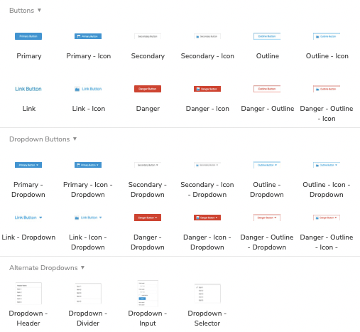
The basic building blocks would be built to be used in a variety of situations. These building blocks were made to be flexible and fit into a variety of layouts. Careful consideration was paid to colors, interaction states, and element padding.
Elements Created
- Buttons
- Input Fields
- Content blocks
- Checkboxes and Radios
- Dropdowns and Picklists
- Loading indicators
- Tags and Chiclets
- Icons
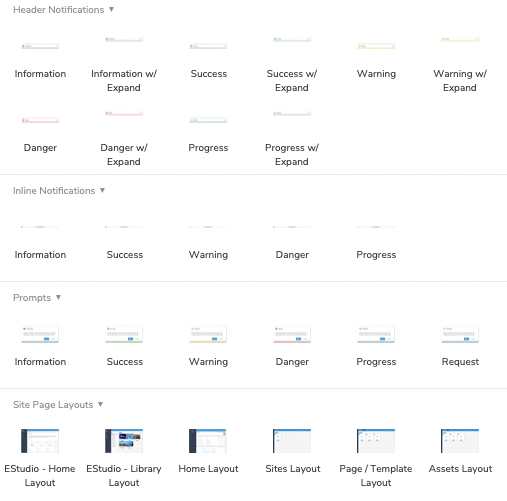
Common Interfaces
As the basic building blocks were created, more complex, but common interfaces could be developed. As with the building blocks before them, these interfaces were designed to be flexible and reusable. As feature enhancements were deployed, these layouts would be updated to match any new UI updates.
Elements Created
- Asset Tiles
- Tables
- Button Groups
- Folder Trees
- Notifications
- Prompts
- Modal Windows
- Navigation Pane
- Page Layouts
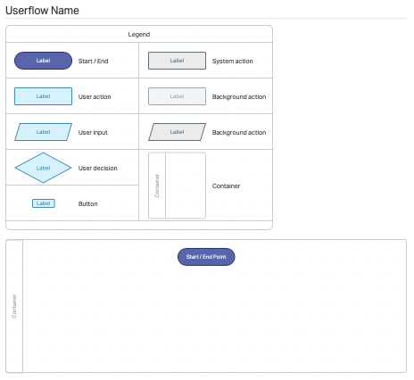
Design Collateral
The final piece was around design collateral. These elements created to ease the creation of the various deliverables that would be included in any given project.
Each of these needed to be visually distinct from the TeamSite design framework.
Elements Created
- User Flow Diagram Templates
- Target Personas
- Visual Design Specifications
- Update Notes