
Asset View
Improve Organizational Tools
Create an Intuitive Interface
Increased Readability and Discoverability
The Asset view project is intended to be a revitalization of the TeamSite asset library. New and infrequent users of TeamSite can often struggle to navigate, browse, and perform specific tasks within the existing library. The Asset View project focuses on standardizing and refining the User Interface of the Folder Tree, Filters, Sorting, and various actions.
Design Tasks
Background
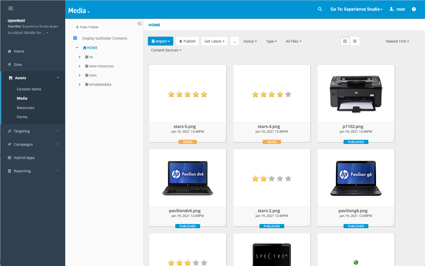
Assets and Media
The TeamSite library is where most users will spend the bulk of their time managing their content and publishing workflows. At its heart, TeamSite remains a publishing platform with strong version controls and decoupled authoring and runtime environments.
But, TeamSite’s library UI has become a bit cluttered and unfocused. The issues start with one of the fundamental functions for a library: Browsing. Common actions like sorting, filtering, and switching between tiles and lists are hard to find. Compounding this issue is a poorly thought out implementation of an endless scroll. The UI is in need of some refinement that will help establish a framework that can accommodate new features and an intuitive interface.
User Personas
Charlie – Web Developer
“Give me something that is functional flexible, efficient, and open.”
- Builds custom applications
- Needs documented API’s
- Works in junction with other developers
- Very technical
Rachel – Campaign Manager
“If only these campaigns would run themselves…”
- Organizes campaigns and events
- Enjoys creative and innovative ideas
- Desire for timely and clear communication
- Strong communicator
Glenn – Content Writer
“I produce the content that drives this business forward.”
- Works with many documents and assets
- Metadata can be an obstacle
- Needs to collaborate on ideas with writing team
- Wants control over content
Jerri – Knowledge Manager
“I do what is needed to keep my team working efficiently.”
- Liaison between Developers and business units
- Oversees multiple teams and has additional system access
- Helps with training new hires
- Willing to build whatever is needed for her team
Key Areas
Stick to the Fundamentals
Browsing remains the most important function for a library. Users can be expected to know how to use folders, filters, sorting, and searching to find the content they are looking for. Therefore it is vital to give users intuitive controls over these actions and to allow them to organize their content as they expect it.
Intuitive User Interface
Whether a user is looking to upload new content, tag existing content, or publish out content, they want to be able to do so easily. An intuitive interface gives users confidence that they are in the right place and are doing the right thing.
Prototypes and Mockups
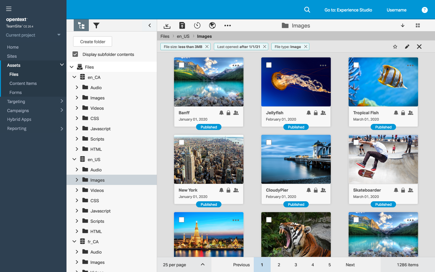
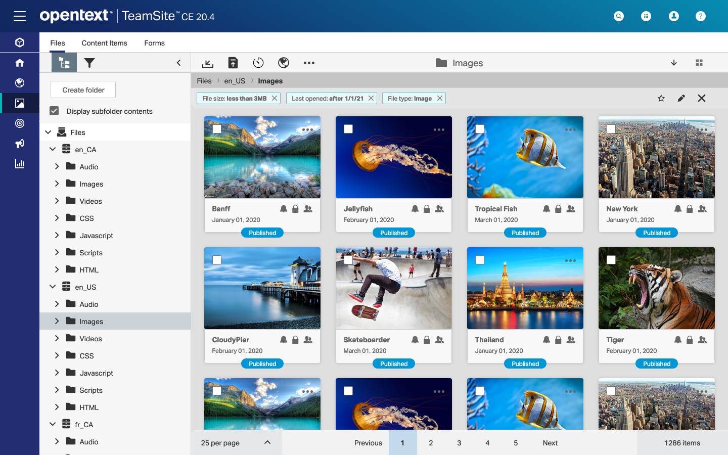
Content Area
The focal point for a library is the content that lives in that library. Users want to be able to find the content they need quickly and easily. Asset tiles are large and easy to browse. They include direct actions, including opening, editing, renaming, moving, and deleting.

Action Toolbar
Anchoring the content area on top is the action toolbar. The action toolbar contains important actions on the left, the current folder name in the center, and sort and view switch on the right. The action buttons are now represented by icons, which save space compared to text based buttons. When the user hovers over the icons, a tooltip provides additional guidance.
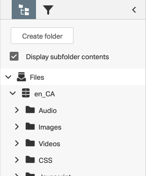
Folder Tree Panel
The folder tree panel remains essentially the same with some key exceptions. Key folders receive new icons to help users distinguish them. Each folder is given more padding to aid in legibility. The overflow menu for each folder has been resized as well. These changes, while small, help make the folder tree a little easier to read.
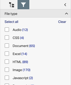
Filter Panel
The filter panel is a new addition to the interface. Where the previous asset library includes filters, using drop-down menus inline with the actions, the new filter panel arranges all of the filter options as a second tab on the folder tree panel. Using this arrangement, users can create multi-faceted filters, including complex filter conditions like file sizes and age, which can require text input.

Filter Toolbar
When the user applies any filters, the filter toolbar is displayed below the action toolbar. The user has options to remove any applied filters, add a new filter, or save this folder and filter as a favorite. The filter toolbar provides some redundancy with the filter panel, providing the user with either option in filtering their view.

Pagination
The Pagination toolbar is anchored to the bottom of the asset view. Pagination provides users with a simple method to navigate through their content. In a perfect world, all content could be loaded simultaneously and users would not be overwhelmed by an abundance of available items. But pagination exists as the best compromise in a world where cognitive overload exists and server response time matters.

Breadcrumb Toolbar
The Breadcrumb Toolbar provides the user with a quick way to view where they are currently located. The breadcrumb toolbar can be toggled on or off by clicking on the folder name in the action toolbar. The breadcrumb toolbar is a redundant method to view folder structure to the folder tree, providing the user with either option as a means of navigation.
Phase Two
The second phase of this project would include upgrading TeamSite to a more modern UI. The asset view can fit into this new framework without much change. Special consideration was paid to the design language of the old and new frameworks.